図解・インフォグラフィック
このモジュールで学ぶこと
- フローチャート・プロセス図の生成
- 組織図・階層構造図の作成
- タイムライン・年表の生成
- 比較表・Before/After図の作成
- インフォグラフィック・データ可視化
学習目標
このモジュールを終えると、以下のことができるようになります:
- ビジネスプロセスをフローチャートで可視化できる
- 組織構造を分かりやすく図解できる
- 時系列データをタイムラインで表現できる
- 比較情報を効果的にビジュアル化できる
- データを魅力的なインフォグラフィックにできる
目次
- 事前準備
- セクション1: フローチャート
- セクション2: 組織図・階層構造
- セクション3: タイムライン
- セクション4: 比較表・Before/After
- セクション5: インフォグラフィック
- セクション6: ステップバイステップ図解
- トラブルシューティング
- まとめ
- よくある質問
事前準備
必要なもの
- 環境構築で構築した環境
- 実写・テキスト・編集で学んだテキスト制御技術
図解生成の基本原則
Nanobananaで図解を生成する際の重要なポイント:
- 論理構造を先に定義: データやプロセスの構造を明確に記述
- レイアウトを明示: 縦/横、左→右、上→下などの方向を指定
- テキストはシンプルに: 各要素のラベルは3-5語以内
- スタイルを統一: フラットデザイン、グラスモーフィズムなど指定
セクション1: フローチャート
1-1. 基本フローチャート
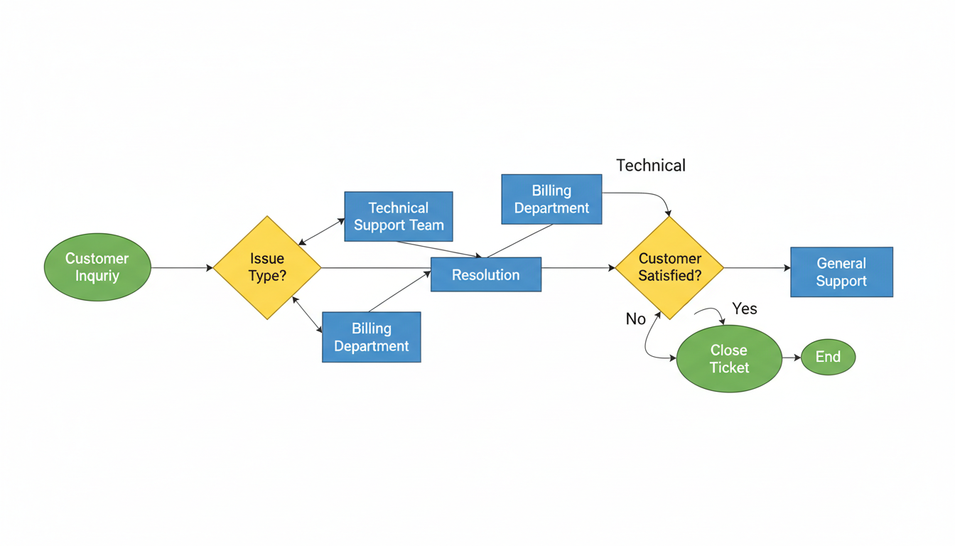
カスタマーサポートプロセスのフローチャートを生成します。
プロンプトの意図:
| 要素 | 記述 | 意図 |
|---|---|---|
| 構造 | Left to Right | 左から右への横型フロー |
| 開始 | "Customer Inquiry" oval shape | 楕円形の開始ノード |
| 分岐 | "Issue Type?" diamond shape | ひし形の判断ノード |
| 処理 | "Resolution" rectangle | 長方形の処理ノード |
| 終了 | "Close Ticket" oval | 楕円形の終了ノード |
| ループ | "No" → Loop back to step 2 | 条件による繰り返し |
| 色分け | Start/End (green), Decision (yellow), Process (blue) | 役割別の色コーディング |
フローチャート形状の種類:
| 形状 | 意味 | 用途 |
|---|---|---|
| 楕円(oval) | 開始/終了 | プロセスの始点と終点 |
| ひし形(diamond) | 判断/分岐 | Yes/No や条件分岐 |
| 長方形(rectangle) | 処理 | 具体的なアクション |
| 矢印(arrow) | フロー | 次のステップへの流れ |
Create a professional flowchart for a customer support process.

Structure (Left to Right):
1. "Customer Inquiry" (Start, oval shape)
   → Arrow →
2. "Issue Type?" (Decision, diamond shape)
   → "Technical" → "Technical Support Team"
   → "Billing" → "Billing Department"
   → "General" → "General Support"
   → All paths converge →
3. "Resolution" (Process, rectangle)
   → Arrow →
4. "Customer Satisfied?" (Decision, diamond)
   → "Yes" → "Close Ticket" (End, oval)
   → "No" → Loop back to step 2

Visual Style:
- Clean, flat design
- Color coding: Start/End (green), Decision (yellow), Process (blue)
- Clear arrows with direction indicators
- White background
- Professional, corporate aesthetic

Text:
- All labels in English
- Clear, legible sans-serif font
- Text centered in each shape

Aspect ratio: 16:9 horizontal layout.
クリックしてPythonコマンドを生成
生成例:
1-2. 縦型フローチャート
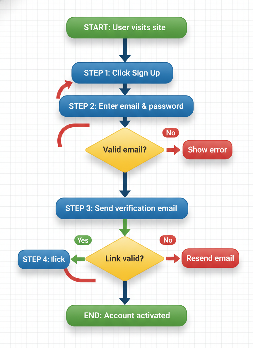
ユーザー登録プロセスの縦型フローチャートを生成します。
プロンプトの意図:
| 要素 | 記述 | 意図 |
|---|---|---|
| 方向 | Top to Bottom | 上から下への縦型フロー |
| 開始 | "User visits site" green oval | 緑の楕円で開始 |
| ステップ | "Click Sign Up" blue rectangle | 青の長方形で処理 |
| 分岐 | "Valid email?" yellow diamond | 黄色のひし形で判断 |
| ループ | → No → loop back | エラー時の繰り返し |
| 終了 | "Account activated" green oval | 緑の楕円で終了 |
プロンプト:
Create a vertical flowchart for a user registration process.

Flow (Top to Bottom):

Start (Green oval): "User visits site"
    ↓
Step 1 (Blue rectangle): "Click Sign Up"
    ↓
Step 2 (Blue rectangle): "Enter email & password"
    ↓
Decision (Yellow diamond): "Valid email?"
    → No (Red arrow) → "Show error" → loop back to Step 2
    → Yes (Green arrow) ↓
Step 3 (Blue rectangle): "Send verification email"
    ↓
Step 4 (Blue rectangle): "User clicks link"
    ↓
Decision (Yellow diamond): "Link valid?"
    → No → "Resend email" → loop to Step 3
    → Yes ↓
End (Green oval): "Account activated"

Style:
- Modern, clean design
- Soft shadows for depth
- Rounded corners on rectangles
- Clear connecting lines with arrows
- White background with subtle grid

Aspect ratio: 3:4 vertical orientation.
クリックしてPythonコマンドを生成
生成例:
確認ポイント:
- 上から下への縦型フローになっているか
- 開始/終了が緑の楕円、処理が青の長方形、分岐が黄色のひし形になっているか
- エラー時のループバック矢印が描かれているか
- モダンでクリーンなデザインになっているか
1-3. スイムレーン図
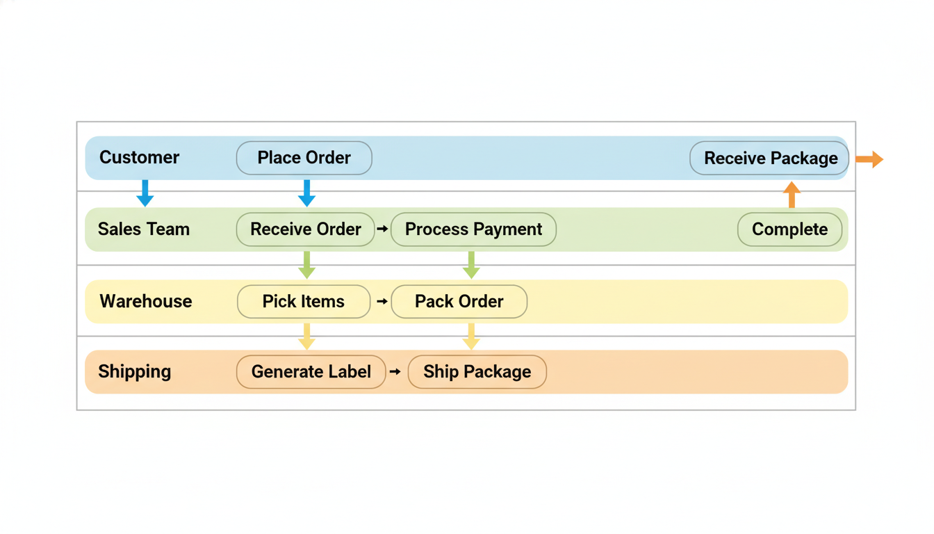
部門間の業務フローを可視化するスイムレーン図を生成します。
プロンプトの意図:
| 要素 | 記述 | 意図 |
|---|---|---|
| レーン | Customer, Sales, Warehouse, Shipping | 4つの部門/役割 |
| 方向 | Left to Right | 左から右への時系列 |
| クロスレーン | arrow down/up | レーンをまたぐ矢印 |
| 色分け | different pastel color | 各レーンを異なる色で区別 |
| スタイル | Professional business diagram | ビジネス向けの専門的デザイン |
プロンプト:
Create a swimlane diagram for an order fulfillment process.

Swimlanes (Horizontal sections, top to bottom):
1. Customer
2. Sales Team
3. Warehouse
4. Shipping

Process Flow (Left to Right):

Customer Lane:
- "Place Order" → (arrow down to Sales)

Sales Team Lane:
- "Receive Order" → "Process Payment" → (arrow down to Warehouse)

Warehouse Lane:
- "Pick Items" → "Pack Order" → (arrow down to Shipping)

Shipping Lane:
- "Generate Label" → "Ship Package" → (arrow up to Customer)

Customer Lane (end):
- "Receive Package" → "Complete"

Visual Style:
- Each lane has a different pastel color
- Clear lane labels on the left
- Arrows crossing lanes are clearly visible
- Professional business diagram aesthetic
- White background

Aspect ratio: 16:9.
クリックしてPythonコマンドを生成
生成例:
確認ポイント:
- 4つのレーン(Customer、Sales、Warehouse、Shipping)が水平に並んでいるか
- 各レーンが異なるパステルカラーで色分けされているか
- レーンをまたぐ矢印が明確に見えるか
- 左から右への時系列フローになっているか
チェックポイント
- 基本フローチャートを生成した
- 縦型フローチャートを生成した
- スイムレーン図を生成した
セクション2: 組織図・階層構造
2-1. 企業組織図
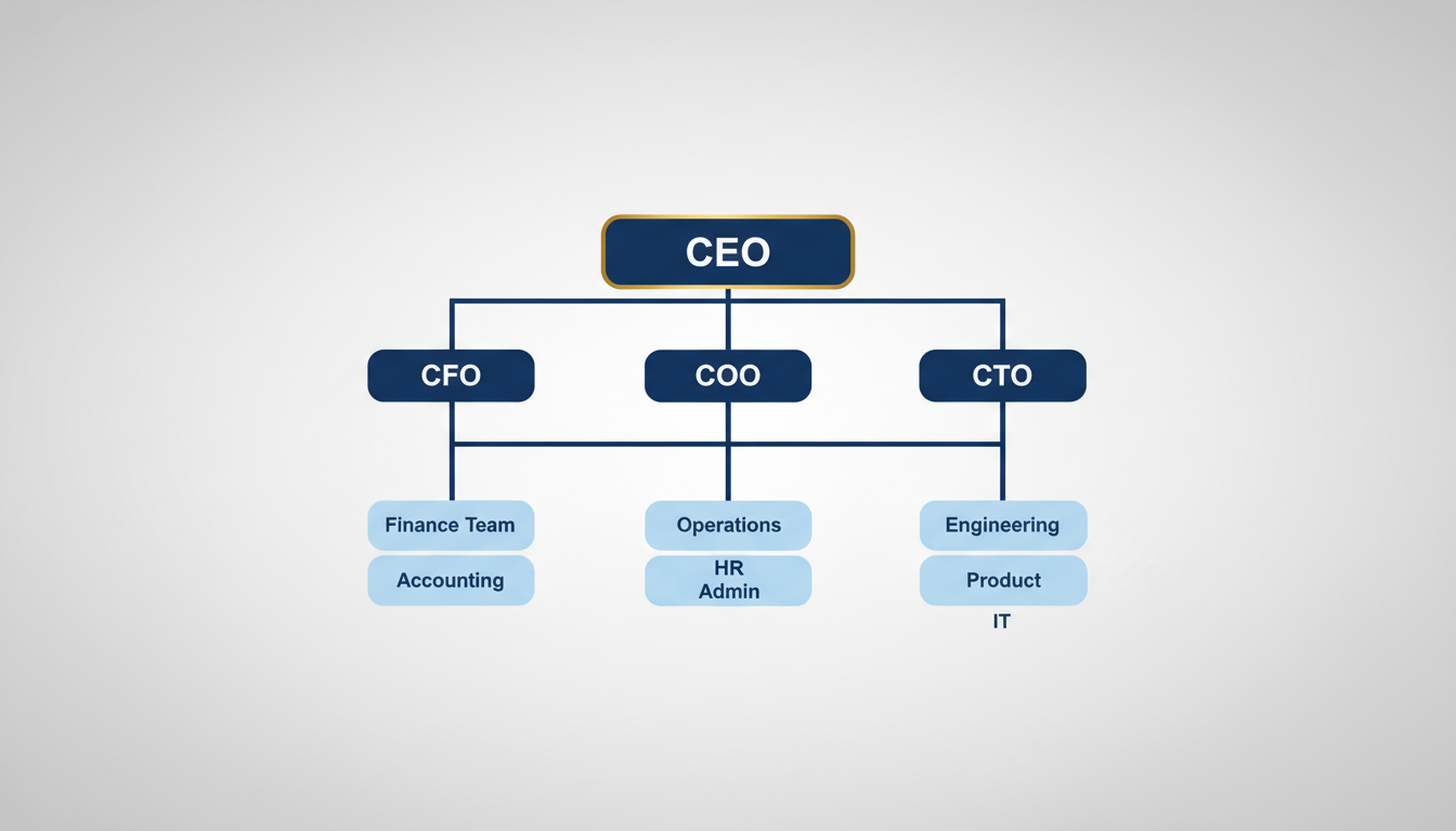
企業の階層構造を可視化する組織図を生成します。
プロンプトの意図:
| 要素 | 記述 | 意図 |
|---|---|---|
| レベル1 | CEO largest box, gold border | 最上位を大きく金縁で強調 |
| レベル2 | CFO, COO, CTO | Cレベルを横並びで配置 |
| レベル3 | 各部門チーム | 各役員の下に部門を配置 |
| 色分け | Navy blue (executives), lighter blue (departments) | 役職レベルで色を変える |
| 接続線 | 90-degree angles | 直角の接続線で整理 |
プロンプト:
Create a corporate organizational chart.

Hierarchy (Top to Bottom):

Level 1 (Top):
- CEO (largest box, gold border)

Level 2:
- CFO | COO | CTO
  (3 boxes side by side, connected to CEO)

Level 3:
- Under CFO: "Finance Team" | "Accounting"
- Under COO: "Operations" | "HR" | "Admin"
- Under CTO: "Engineering" | "Product" | "IT"

Visual Design:
- Clean, modern boxes with rounded corners
- Hierarchy indicated by size (larger = higher rank)
- Connecting lines clear and straight
- Color scheme: Navy blue for executives, lighter blue for departments
- Professional corporate aesthetic

Layout:
- Centered, symmetrical arrangement
- Clear spacing between levels
- Connecting lines with 90-degree angles

Background: Light gray gradient.
Aspect ratio: 16:9.
クリックしてPythonコマンドを生成
生成例:
確認ポイント:
- CEOが最上部に大きく金縁で表示されているか
- CFO、COO、CTOが横並びでCEOの下に接続されているか
- 各役員の下に関連部門が配置されているか
- ネイビーブルー(役員)と明るい青(部門)の色分けになっているか
2-2. ピラミッド構造
マズローの欲求階層をピラミッド図で可視化します。
プロンプトの意図:
| 要素 | 記述 | 意図 |
|---|---|---|
| 構造 | Bottom to Top | 下から上への階層 |
| ベース | Physiological Needs (Orange) | 生理的欲求を最下層に |
| 中間層 | Safety, Love, Esteem | 段階的に上位の欲求 |
| 頂点 | Self-Actualization (Purple) | 自己実現を最上位に |
| 視覚効果 | 3D pyramid with shadows | 立体感のあるピラミッド |
プロンプト:
Create a pyramid diagram showing Maslow's hierarchy of needs.

Structure (Bottom to Top):

Layer 1 (Base, widest):
- "Physiological Needs" - Food, water, shelter
- Color: Orange

Layer 2:
- "Safety Needs" - Security, stability
- Color: Yellow

Layer 3:
- "Love & Belonging" - Relationships, community
- Color: Green

Layer 4:
- "Esteem" - Achievement, respect
- Color: Blue

Layer 5 (Top, smallest):
- "Self-Actualization" - Reaching full potential
- Color: Purple

Visual Style:
- 3D pyramid effect with subtle shadows
- Each layer clearly labeled
- Small icons representing each need
- Clean, educational infographic style
- White background

Text must be clearly readable on each layer.
Aspect ratio: 1:1 square.
クリックしてPythonコマンドを生成
生成例:
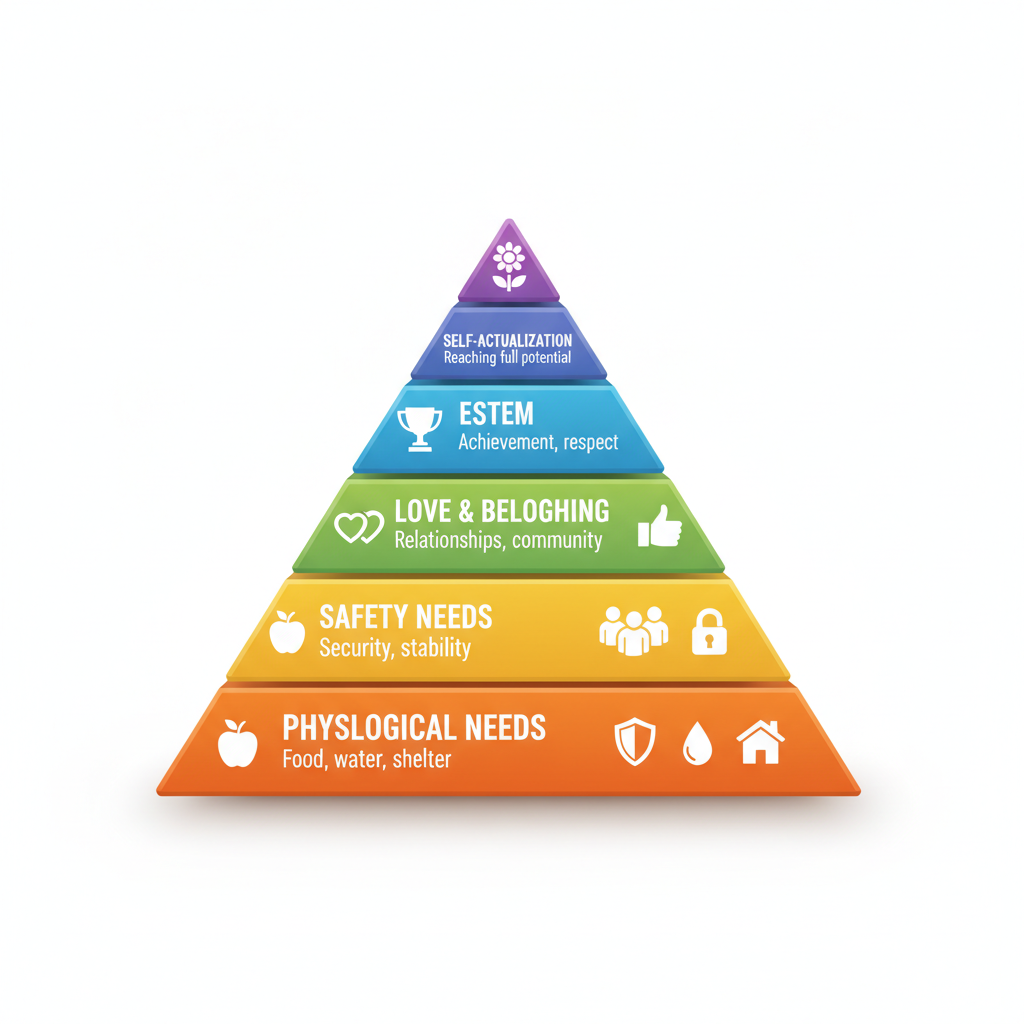
確認ポイント:
- 5層のピラミッドが下から上へ正しく配置されているか
- 各層が指定された色(オレンジ→黄→緑→青→紫)になっているか
- 各層のラベルが読みやすく表示されているか
- 3D効果と影で立体感があるか
2-3. マインドマップ
プロジェクト計画のマインドマップを生成します。
プロンプトの意図:
| 要素 | 記述 | 意図 |
|---|---|---|
| 中心 | "Project Plan" blue circle | 中央に大きな青い円 |
| 4方向 | Timeline, Resources, Goals, Risks | 4つの主要ブランチ |
| サブトピック | Milestones, Team, KPIs... | 各ブランチの詳細項目 |
| 線 | Organic, flowing branch lines | 有機的で流れるような線 |
| 色分け | Each branch distinct color | ブランチごとに異なる色 |
プロンプト:
Create a mind map for project planning.

Central Node:
- "Project Plan" (large, centered, blue circle)

Main Branches (4 directions):

Right Branch - "Timeline":
- Sub: "Milestones"
- Sub: "Deadlines"
- Sub: "Dependencies"

Left Branch - "Resources":
- Sub: "Team"
- Sub: "Budget"
- Sub: "Tools"

Top Branch - "Goals":
- Sub: "Objectives"
- Sub: "KPIs"
- Sub: "Success Criteria"

Bottom Branch - "Risks":
- Sub: "Technical"
- Sub: "Budget"
- Sub: "Schedule"

Visual Style:
- Organic, flowing branch lines
- Each main branch has a distinct color
- Sub-topics in smaller bubbles
- Clean, modern aesthetic
- White background

All text must be clearly legible.
Aspect ratio: 1:1.
クリックしてPythonコマンドを生成
生成例:
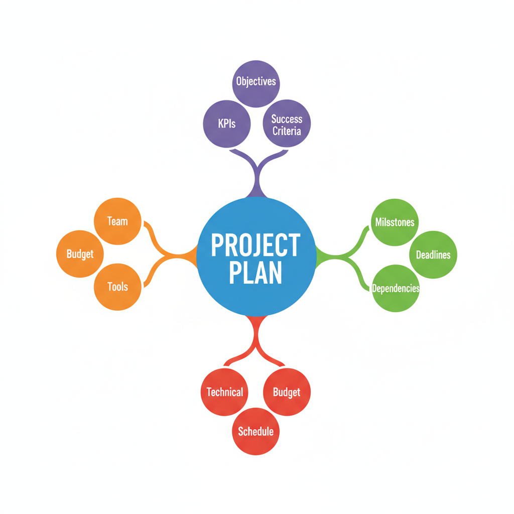
確認ポイント:
- 中央に「Project Plan」が大きな青い円で表示されているか
- 4方向(右、左、上、下)に主要ブランチが伸びているか
- 各ブランチが異なる色で区別されているか
- サブトピックが小さなバブルで表示されているか
チェックポイント
- 組織図を生成した
- ピラミッド図を生成した
- マインドマップを生成した
セクション3: タイムライン
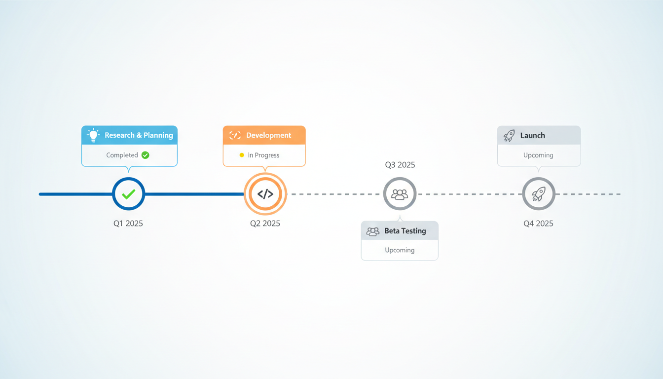
3-1. 横型タイムライン
製品ロードマップ用の横型タイムラインを生成します。
プロンプトの意図:
| 要素 | 記述 | 意図 |
|---|---|---|
| 方向 | Left to Right | 左から右への時系列 |
| マイルストーン | Q1 2025, Q2 2025... | 四半期ごとの区切り |
| ステータス | Completed, In Progress, Upcoming | 進捗状況の視覚化 |
| アイコン | Lightbulb, Code brackets, Users, Rocket | 各フェーズを象徴するアイコン |
| 色分け | Completed (blue), Current (orange), Upcoming (gray) | ステータス別の色 |
| レイアウト | alternating above/below | カードを上下に交互配置 |
ステータスの視覚表現:
| ステータス | 色 | マーカー |
|---|---|---|
| 完了 | 青(blue filled) | チェックマーク |
| 進行中 | オレンジ(orange) | 点滅ドット |
| 未着手 | グレー(gray outline) | 空のサークル |
Create a horizontal timeline for a product launch roadmap.

Timeline (Left to Right, 4 milestones):

Q1 2025:
- "Research & Planning"
- Icon: Lightbulb
- Status: Completed (green checkmark)

Q2 2025:
- "Development"
- Icon: Code brackets
- Status: In Progress (yellow dot)

Q3 2025:
- "Beta Testing"
- Icon: Users
- Status: Upcoming (gray)

Q4 2025:
- "Launch"
- Icon: Rocket
- Status: Upcoming (gray)

Visual Design:
- Horizontal line with circular milestone markers
- Each milestone has a card above or below (alternating)
- Progress indicated by line color (completed = blue, upcoming = gray)
- Modern, tech-forward aesthetic
- Clean icons for each phase

Colors:
- Completed: Blue filled circle
- Current: Orange pulsing circle
- Upcoming: Gray outline circle

Background: White with subtle gradient.
Aspect ratio: 16:9.
クリックしてPythonコマンドを生成
生成例:
3-2. 縦型タイムライン
会社の歴史を縦型タイムラインで可視化します。
プロンプトの意図:
| 要素 | 記述 | 意図 |
|---|---|---|
| 方向 | Top to Bottom | 上から下への時系列 |
| マイルストーン | 2015-2025 | 6つの重要な年 |
| 配置 | Alternating left/right | 左右交互のカード配置 |
| アイコン | Office, Handshake, Chart... | 各イベントを象徴 |
| 色 | Blue gradient theme | 青のグラデーションテーマ |
プロンプト:
Create a vertical timeline showing company history.

Timeline (Top to Bottom, oldest to newest):

2015:
- "Company Founded"
- Small image: Office building
- Brief text: "Started with 3 founders"

2017:
- "First Major Client"
- Small image: Handshake
- Brief text: "Fortune 500 partnership"

2019:
- "Series A Funding"
- Small image: Growth chart
- Brief text: "$10M raised"

2021:
- "100 Employees"
- Small image: Team
- Brief text: "Global expansion"

2023:
- "IPO"
- Small image: Stock chart
- Brief text: "NYSE listing"

2025:
- "Today"
- Small image: Globe
- Brief text: "Serving 50+ countries"

Visual Style:
- Vertical line in center
- Alternating left/right card placement
- Year prominently displayed
- Small illustrative icons
- Corporate, professional aesthetic

Colors: Blue gradient theme.
Aspect ratio: 9:16 vertical.
クリックしてPythonコマンドを生成
生成例:
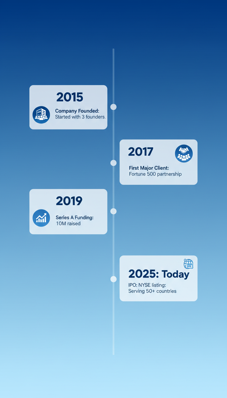
確認ポイント:
- 中央に縦線があり、カードが左右交互に配置されているか
- 2015年から2025年までの6つのマイルストーンがあるか
- 各マイルストーンに年、タイトル、簡単な説明、アイコンがあるか
- 青のグラデーションテーマになっているか
3-3. プロジェクトガントチャート風
プロジェクトのタスクと期間を可視化するガントチャート風の図を生成します。
プロンプトの意図:
| 要素 | 記述 | 意図 |
|---|---|---|
| 縦軸 | Research, Design, Development... | 5つのタスク |
| 横軸 | Week 1-6 | 6週間のタイムライン |
| バー | colored bars showing duration | 期間を色付きバーで表示 |
| 色分け | Blue, Green, Orange, Purple, Red | タスクごとに異なる色 |
| マーカー | Current week marker (red line) | 現在週を赤線で表示 |
プロンプト:
Create a simplified Gantt chart style project timeline.

Structure:

Vertical Axis (Tasks, top to bottom):
1. Research
2. Design
3. Development
4. Testing
5. Launch

Horizontal Axis (Time):
- Week 1 | Week 2 | Week 3 | Week 4 | Week 5 | Week 6

Task Bars:
- Research: Week 1-2 (Blue bar)
- Design: Week 2-3 (Green bar)
- Development: Week 3-5 (Orange bar)
- Testing: Week 4-5 (Purple bar)
- Launch: Week 6 (Red bar, short)

Visual Elements:
- Horizontal colored bars showing duration
- Grid lines for clarity
- Task labels on left
- Week numbers on top
- Current week marker (vertical red line)

Style:
- Clean, minimal design
- Clear color coding
- Professional project management aesthetic

Background: White with light grid.
Aspect ratio: 16:9.
クリックしてPythonコマンドを生成
生成例:
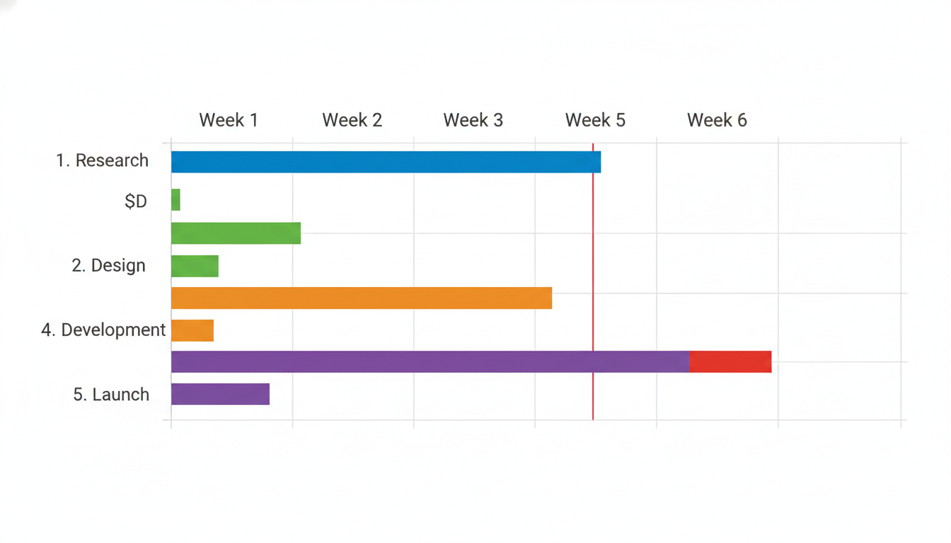
確認ポイント:
- 左側にタスク名、上部に週番号があるか
- 各タスクが色付きの水平バーで期間を表しているか
- タスク間の依存関係(重なり)が見えるか
- 現在週を示す赤い垂直線があるか
チェックポイント
- 横型タイムラインを生成した
- 縦型タイムラインを生成した
- ガントチャートを生成した
セクション4: 比較表・Before/After
4-1. Before/After比較
ウェブサイトリデザインのBefore/After比較図を生成します。
プロンプトの意図:
| 要素 | 記述 | 意図 |
|---|---|---|
| レイアウト | Split screen (left/right) | 左右分割の比較 |
| Before | Cluttered, outdated, gray | 古い、ごちゃごちゃしたデザイン |
| After | Clean, modern, blue/white | モダンで整理されたデザイン |
| ラベル | "Before" red, "After" green | 色で状態を区別 |
| 効果 | Arrow or transition effect | 変化を示す矢印 |
プロンプト:
Create a before/after comparison graphic for a website redesign.

Layout: Split screen (left/right)

LEFT SIDE - "Before":
- Label: "Before" in red
- Old website mockup showing:
  - Cluttered layout
  - Small text
  - Outdated colors (gray, dull)
  - Poor navigation
  - "2019" watermark

RIGHT SIDE - "After":
- Label: "After" in green
- New website mockup showing:
  - Clean, modern layout
  - Clear typography
  - Fresh colors (blue, white)
  - Intuitive navigation
  - "2025" watermark

Visual Elements:
- Clear dividing line in center
- Arrow or transition effect between sides
- Subtle shadow/highlight on "After" side
- Professional mockup frames

Style:
- Clean, modern design
- Clear contrast between old and new
- Highlight improvements visually

Aspect ratio: 16:9.
クリックしてPythonコマンドを生成
生成例:
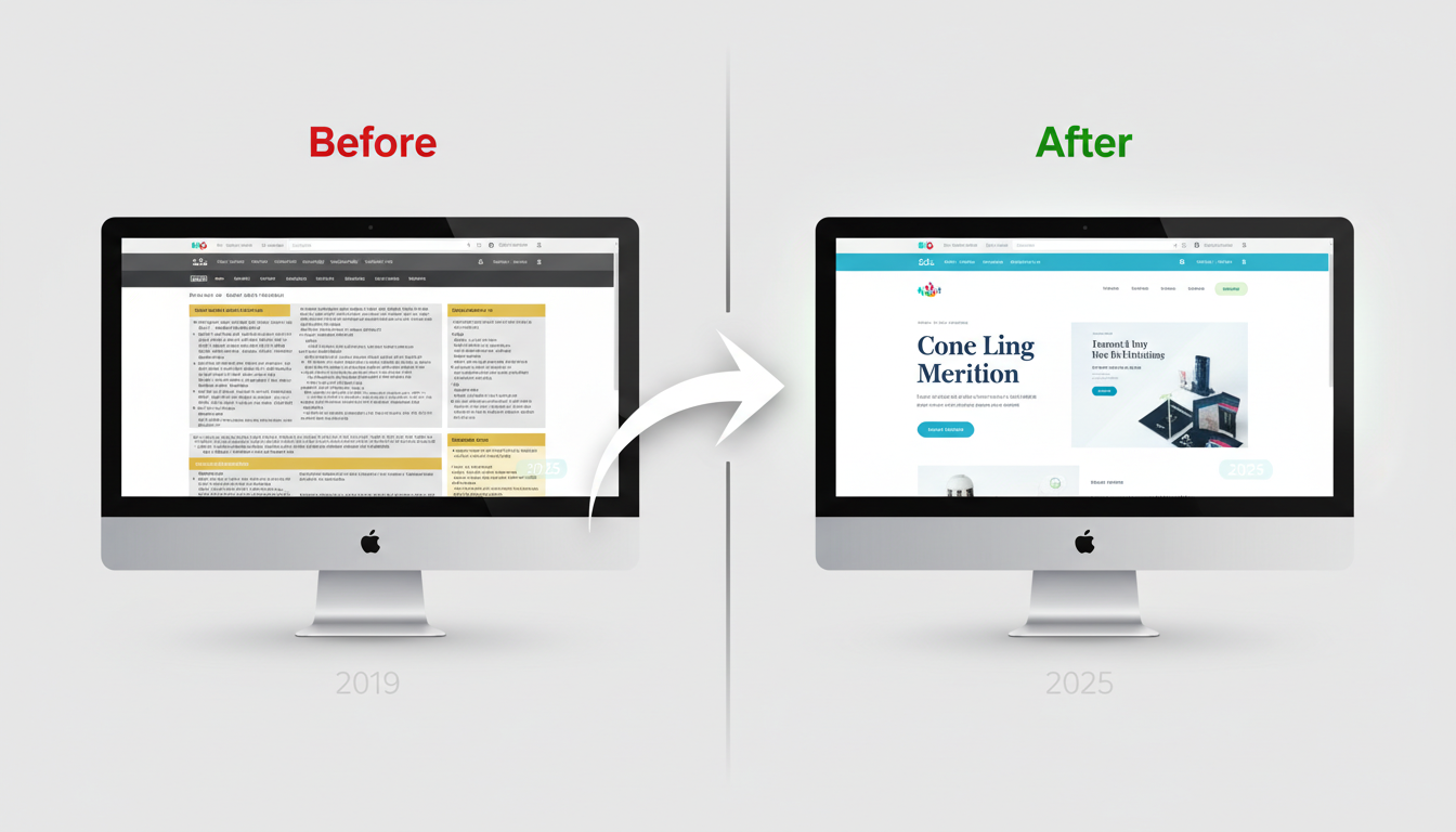
確認ポイント:
- 左右に分割されたレイアウトになっているか
- 左側(Before)が古くごちゃごちゃしたデザインか
- 右側(After)がモダンで整理されたデザインか
- 「Before」が赤、「After」が緑のラベルになっているか
4-2. 製品比較表
3つのサブスクリプションプランを比較する価格表を生成します。
プロンプトの意図:
| 要素 | 記述 | 意図 |
|---|---|---|
| レイアウト | 3 columns side by side | 3列横並び |
| Basic | $9/mo, Gray header | 基本プラン、グレー |
| Pro | $29/mo, Blue header, RECOMMENDED | おすすめプラン、青、強調 |
| Enterprise | Custom, Gold header | エンタープライズ、金 |
| アイコン | ✓ green, ✗ red | 機能の有無を色で表示 |
プロンプト:
Create a product comparison chart for 3 subscription plans.

Layout: 3 columns side by side

Column 1 - "Basic" (Gray header):
- Price: "$9/mo"
- Features:
  - ✓ 5 Users
  - ✓ 10GB Storage
  - ✗ Priority Support
  - ✗ API Access
  - ✗ Custom Domain

Column 2 - "Pro" (Blue header, RECOMMENDED badge):
- Price: "$29/mo"
- Features:
  - ✓ 25 Users
  - ✓ 100GB Storage
  - ✓ Priority Support
  - ✓ API Access
  - ✗ Custom Domain

Column 3 - "Enterprise" (Gold header):
- Price: "Custom"
- Features:
  - ✓ Unlimited Users
  - ✓ Unlimited Storage
  - ✓ Priority Support
  - ✓ API Access
  - ✓ Custom Domain

Visual Design:
- Clean card design for each column
- "Pro" column slightly elevated/highlighted
- Green checkmarks, red X marks
- Clear typography
- CTA button at bottom of each column

Style: Modern SaaS pricing page aesthetic.
Aspect ratio: 16:9.
クリックしてPythonコマンドを生成
生成例:
確認ポイント:
- 3つのプランが横並びに表示されているか
- Proプランが強調(RECOMMENDED)されているか
- 緑のチェックマークと赤のXマークで機能の有無が示されているか
- 各列の下部にCTAボタンがあるか
4-3. Pros/Cons表
リモートワークのメリット・デメリットを比較する図を生成します。
プロンプトの意図:
| 要素 | 記述 | 意図 |
|---|---|---|
| トピック | Remote Work | リモートワーク |
| Pros | Green theme, thumbs up | 緑テーマ、良い点 |
| Cons | Red theme, thumbs down | 赤テーマ、悪い点 |
| 項目数 | 5 items each | 各5項目でバランス |
| スタイル | Professional, objective | 客観的なプレゼン |
プロンプト:
Create a pros and cons comparison graphic.

Topic: "Remote Work"

Layout: Two columns

LEFT COLUMN - "Pros" (Green theme):
- Icon: Thumbs up
- Items with green checkmarks:
  1. "Flexible schedule"
  2. "No commute"
  3. "Work-life balance"
  4. "Reduced costs"
  5. "Global talent access"

RIGHT COLUMN - "Cons" (Red theme):
- Icon: Thumbs down
- Items with red X marks:
  1. "Communication challenges"
  2. "Isolation"
  3. "Distractions at home"
  4. "Time zone differences"
  5. "Harder collaboration"

Visual Style:
- Clean, balanced layout
- Clear icons for each point
- Color coding (green left, red right)
- Professional, objective presentation
- White background with subtle shadows

Aspect ratio: 16:9.
クリックしてPythonコマンドを生成
生成例:
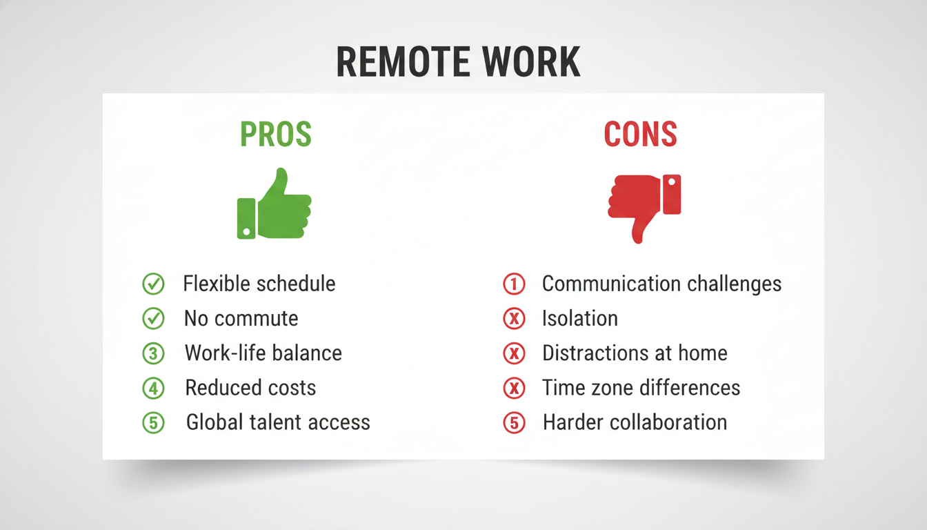
確認ポイント:
- 左右2列のレイアウトになっているか
- 左側(Pros)が緑テーマで親指アップアイコンがあるか
- 右側(Cons)が赤テーマで親指ダウンアイコンがあるか
- 各列に5つの項目がチェック/Xマークと共にあるか
チェックポイント
- Before/After比較を生成した
- 製品比較表を生成した
- Pros/Cons比較を生成した
セクション5: インフォグラフィック
5-1. 統計インフォグラフィック
統計データを視覚化するインフォグラフィックを生成します。
プロンプトの意図:
| 要素 | 記述 | 意図 |
|---|---|---|
| タイトル | "Global Internet Usage 2025" | テーマを明確に |
| レイアウト | 2x2 grid arrangement | 4つの統計を2x2グリッドで配置 |
| 数字の強調 | numbers largest | 数値を最も大きく表示 |
| アイコン | Globe, People, Clock, Smartphone | 各統計を視覚的に表現 |
| 色 | Blue and teal color scheme | データ分析的な色使い |
| サイズ | 1:1 square | Instagram投稿向け |
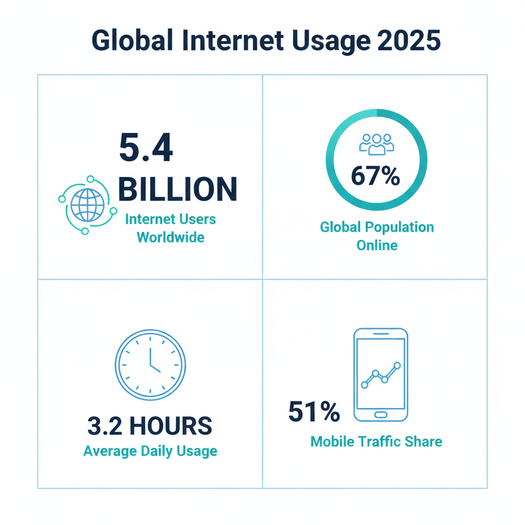
統計データの構成:
| 統計 | 数値 | ラベル | ビジュアル |
|---|---|---|---|
| 1 | 5.4 Billion | Internet Users | 地球ネットワーク |
| 2 | 67% | Population Online | プログレスバー |
| 3 | 3.2 Hours | Daily Usage | 時計グラフィック |
| 4 | 51% | Mobile Traffic | スマホ+グラフ |
Create a statistics infographic about global internet usage.

Title: "Global Internet Usage 2025"

Content (4 key statistics):

Stat 1:
- Number: "5.4 Billion"
- Label: "Internet Users Worldwide"
- Icon: Globe with network lines
- Visual: Large number prominently displayed

Stat 2:
- Number: "67%"
- Label: "Global Population Online"
- Icon: People group
- Visual: Circular progress bar at 67%

Stat 3:
- Number: "3.2 Hours"
- Label: "Average Daily Usage"
- Icon: Clock
- Visual: Clock graphic

Stat 4:
- Number: "51%"
- Label: "Mobile Traffic Share"
- Icon: Smartphone
- Visual: Phone with graph

Layout:
- 2x2 grid arrangement
- Each stat in its own section
- Clean dividers between sections

Style:
- Modern, data-driven aesthetic
- Blue and teal color scheme
- White background
- Clear hierarchy (numbers largest)

Aspect ratio: 1:1 square (Instagram-ready).
クリックしてPythonコマンドを生成
生成例:
5-2. プロセスインフォグラフィック
コーヒーの製造工程を可視化するプロセスインフォグラフィックを生成します。
プロンプトの意図:
| 要素 | 記述 | 意図 |
|---|---|---|
| タイトル | "From Bean to Cup" | 豆からカップまでの旅 |
| ステップ | 5 steps, top to bottom | 5ステップの縦フロー |
| アイコン | Coffee plant, Water, Flames... | 各工程を象徴 |
| 色 | Warm coffee colors (browns, creams) | コーヒーらしい暖色系 |
| スタイル | Hand-drawn illustration | 手描き風イラスト |
プロンプト:
Create an infographic showing "How Coffee is Made".

Title: "From Bean to Cup" (centered at top)

Process Flow (top to bottom, 5 steps):

Step 1: "Harvesting"
- Icon: Coffee plant/cherries
- Brief: "Hand-picked ripe cherries"

Step 2: "Processing"
- Icon: Water/wash station
- Brief: "Washed and dried"

Step 3: "Roasting"
- Icon: Roasting drum with flames
- Brief: "165°C to 220°C"

Step 4: "Grinding"
- Icon: Coffee grinder
- Brief: "Coarse to fine"

Step 5: "Brewing"
- Icon: Coffee cup with steam
- Brief: "Your perfect cup"

Visual Elements:
- Vertical flow with connecting arrows/lines
- Each step has an illustrated icon
- Step numbers prominently displayed
- Warm coffee colors (browns, creams)
- Subtle coffee bean decorative elements

Style:
- Hand-drawn illustration style
- Warm, inviting aesthetic
- Educational but visually appealing

Aspect ratio: 9:16 vertical (for Pinterest/Stories).
クリックしてPythonコマンドを生成
生成例:
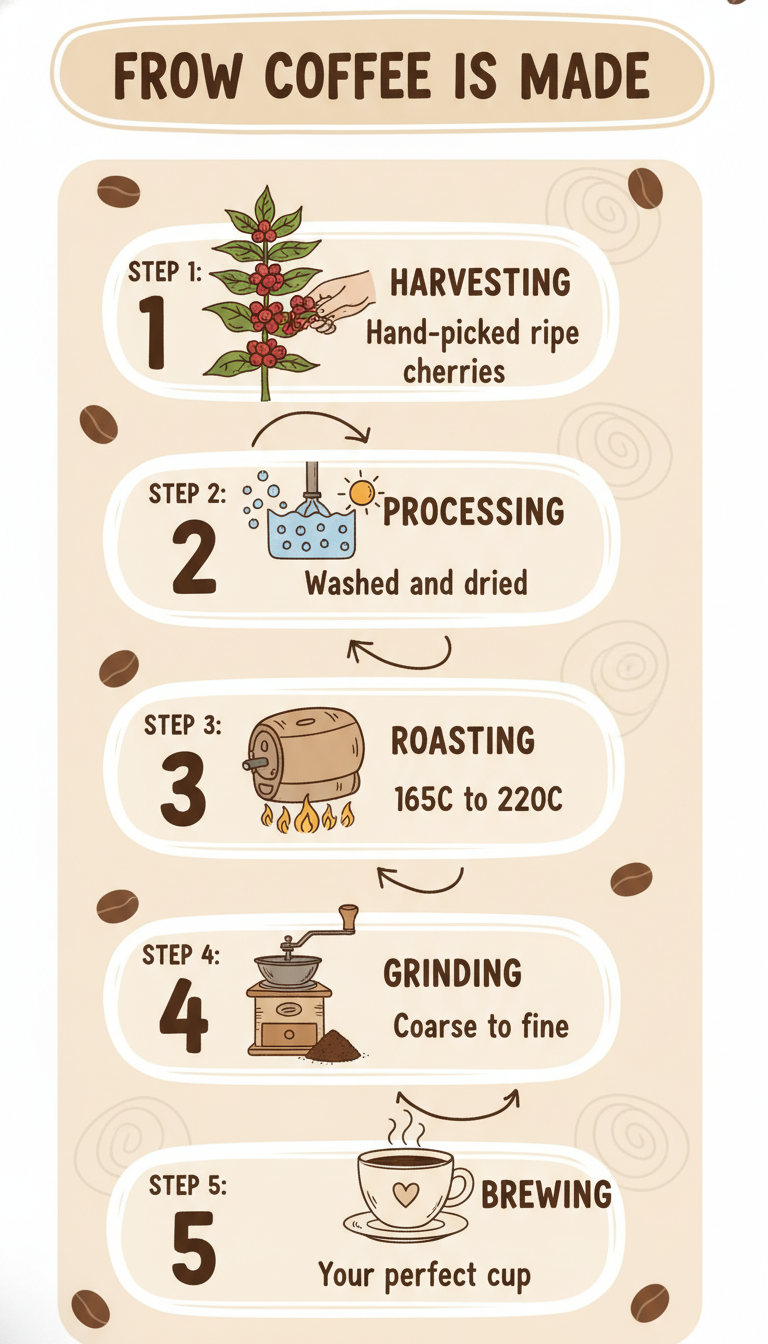
確認ポイント:
- 「From Bean to Cup」がタイトルとして上部にあるか
- 5つのステップが上から下へ縦に配置されているか
- 各ステップにアイコンと簡単な説明があるか
- コーヒーブラウンとクリームの暖色系になっているか
5-3. データ可視化インフォグラフィック
気候変動データを可視化するインフォグラフィックを生成します。
プロンプトの意図:
| 要素 | 記述 | 意図 |
|---|---|---|
| タイトル | "Climate Change: The Numbers" | データで訴える |
| セクション1 | Temperature Rise, 1.1°C | 温度上昇を温度計で |
| セクション2 | Sea Level Rise, 21cm | 海面上昇を波で |
| セクション3 | Arctic Ice Loss, 13% | 氷の減少を氷山で |
| セクション4 | CO2 Levels, 421 ppm | CO2を工場で |
| CTA | "What You Can Do" | 行動喚起 |
プロンプト:
Create an infographic visualizing climate change data.

Title: "Climate Change: The Numbers" (bold, at top)

Section 1: Temperature Rise
- Large thermometer graphic
- "1.1°C" warming since 1880
- Red gradient showing increase

Section 2: Sea Level Rise
- Wave graphic with rising line
- "21cm" rise in last century
- Blue water colors

Section 3: Arctic Ice Loss
- Ice cube/glacier shrinking visual
- "13%" decline per decade
- White/blue cold colors

Section 4: CO2 Levels
- Factory/smoke stack icon
- "421 ppm" current level
- Gray to black gradient

Section 5: Call to Action
- "What You Can Do" header
- 3 simple action icons
- Green positive colors

Layout:
- Flowing vertical arrangement
- Each section clearly separated
- Icons and numbers prominent
- Dark background for impact

Style:
- Serious, impactful
- Data journalism aesthetic
- Clear visual hierarchy

Aspect ratio: 9:16.
クリックしてPythonコマンドを生成
生成例:
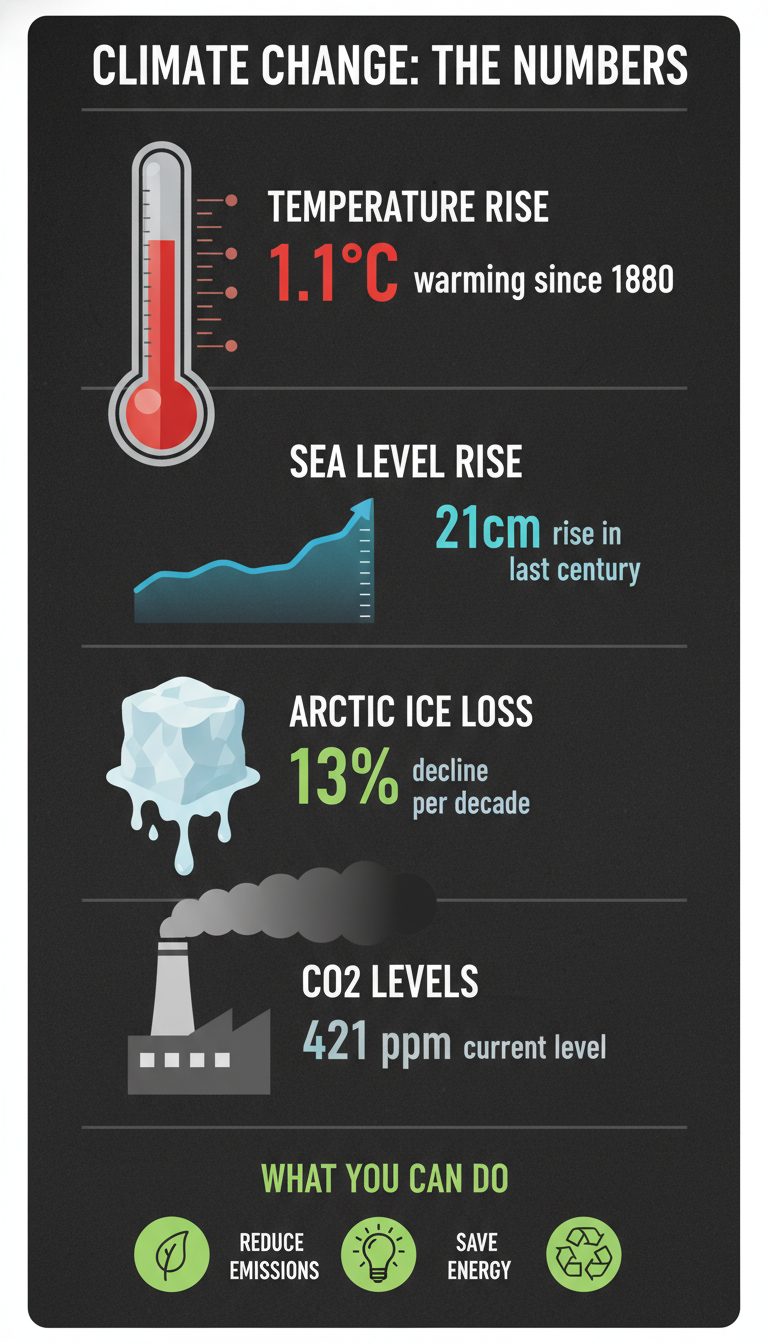
確認ポイント:
- 5つのセクションが縦に配置されているか
- 各セクションに適切なグラフィック(温度計、波、氷山など)があるか
- 数字(1.1°C、21cm、13%、421 ppm)が目立つように表示されているか
- 暗い背景でインパクトがあるか
チェックポイント
- 統計インフォグラフィックを生成した
- プロセスインフォグラフィックを生成した
- データ可視化インフォグラフィックを生成した
セクション6: ステップバイステップ図解
6-1. 手順説明図
ネクタイの結び方を説明するステップバイステップ図解を生成します。
プロンプトの意図:
| 要素 | 記述 | 意図 |
|---|---|---|
| タイトル | "How to Tie a Windsor Knot" | ウィンザーノットの結び方 |
| ステップ数 | 6 steps, numbered | 6つの番号付きステップ |
| イラスト | Simple line illustrations | シンプルな線画 |
| レイアウト | 2x3 grid arrangement | 2×3のグリッド配置 |
| 色 | Navy blue tie | ネイビーブルーのネクタイ |
プロンプト:
Create a step-by-step instruction graphic for "How to Tie a Tie".

Title: "How to Tie a Windsor Knot"

Steps (6 steps, numbered):

Step 1:
- Illustration: Tie draped around neck, wide end on right
- Text: "Start with wide end on your right"

Step 2:
- Illustration: Wide end crossed over narrow
- Text: "Cross wide end over narrow"

Step 3:
- Illustration: Wide end pulled up through loop
- Text: "Bring wide end up through the loop"

Step 4:
- Illustration: Wide end wrapped around
- Text: "Wrap around the back"

Step 5:
- Illustration: Wide end pulled through knot
- Text: "Pull through the front loop"

Step 6:
- Illustration: Finished knot, tightened
- Text: "Tighten and adjust"

Visual Style:
- Simple line illustrations
- Step numbers in circles
- Clear directional arrows
- Professional, elegant aesthetic
- Navy blue tie in illustrations

Layout:
- 2x3 grid arrangement
- Clear progression from 1 to 6
- Consistent illustration style

Background: Light cream/off-white.
Aspect ratio: 1:1.
クリックしてPythonコマンドを生成
生成例:

確認ポイント:
- 6つのステップが2×3グリッドに配置されているか
- 各ステップに番号、イラスト、説明テキストがあるか
- シンプルな線画スタイルで統一されているか
- 方向を示す矢印があるか
6-2. 料理レシピ図解
スクランブルエッグのビジュアルレシピカードを生成します。
プロンプトの意図:
| 要素 | 記述 | 意図 |
|---|---|---|
| タイトル | "Perfect Scrambled Eggs" script font | 手書き風タイトル |
| 材料 | eggs, butter, salt, chives with icons | 材料をアイコンで表示 |
| ステップ | 5 steps with illustrations | 各工程をイラストで |
| レイアウト | Ingredients left, Steps right | 左に材料、右に手順 |
| スタイル | Hand-drawn, cozy, appetizing | 温かみのある手描き風 |
プロンプト:
Create a visual recipe card for "Perfect Scrambled Eggs".

Title: "Perfect Scrambled Eggs" (script font)

Ingredients (left side):
- 3 eggs (icon)
- Butter (icon)
- Salt & pepper (icon)
- Chives (icon)

Steps (right side, visual flow):

Step 1: "Crack & Whisk"
- Bowl with eggs being whisked
- "Beat until smooth"

Step 2: "Heat Pan"
- Pan on stove with butter melting
- "Medium-low heat"

Step 3: "Pour & Stir"
- Eggs being poured into pan
- "Stir constantly"

Step 4: "Remove Early"
- Slightly wet eggs in pan
- "Remove at 80% done"

Step 5: "Serve"
- Finished eggs on plate with garnish
- "Top with chives"

Visual Style:
- Hand-drawn, cozy illustration style
- Warm, appetizing colors
- Recipe card aesthetic
- Clear step numbering

Layout:
- Ingredients on left (narrow column)
- Steps on right (main area)
- Decorative border

Aspect ratio: 4:5 (Instagram portrait).
クリックしてPythonコマンドを生成
生成例:
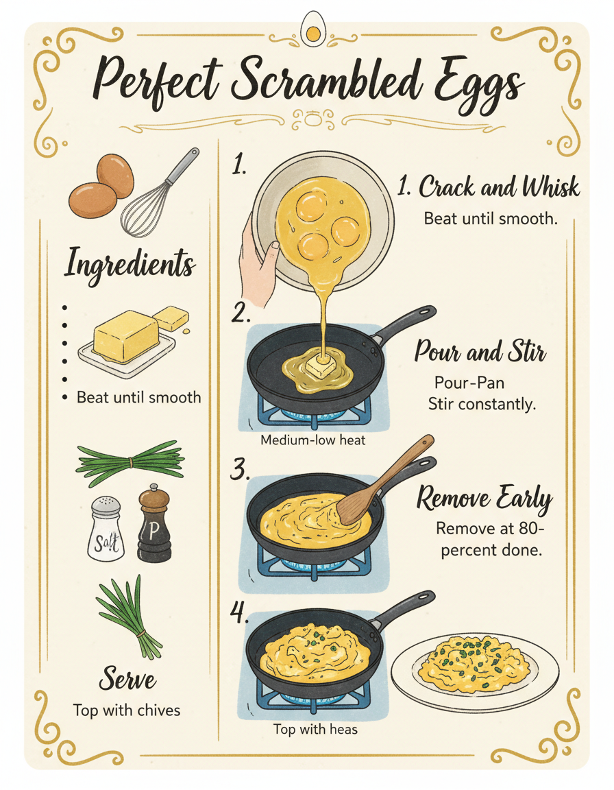
確認ポイント:
- タイトルが手書き風スクリプトフォントになっているか
- 左側に材料がアイコン付きで表示されているか
- 右側に5つのステップがイラスト付きで表示されているか
- 温かみのある手描き風イラストになっているか
6-3. テクニカル手順図
ホームサーバーセットアップのテクニカルガイドを生成します。
プロンプトの意図:
| 要素 | 記述 | 意図 |
|---|---|---|
| ハードウェア | Computer, Router, Cables, Storage icons | 必要機材をアイコンで |
| ステップ | 6 numbered steps | 6つの番号付きステップ |
| OS | Ubuntu Server 24.04 | 使用するOSを明示 |
| サービス | Docker, Nginx | インストールするサービス |
| 色 | Blue and dark gray | テック感のある色 |
プロンプト:
Create a technical setup guide for "Setting up a Home Server".

Title: "Home Server Setup Guide"

Hardware Required (top section):
- Icons: Computer, Router, Cables, Storage
- Brief labels for each

Steps (numbered, flowing):

Step 1: "Physical Setup"
- Diagram: Server connected to router
- Labels: Power, Ethernet, Storage

Step 2: "Install OS"
- Screen showing installation
- "Ubuntu Server 24.04"

Step 3: "Configure Network"
- Terminal window graphic
- "Set static IP"

Step 4: "Install Services"
- Docker logo, database icons
- "Docker, Nginx, etc."

Step 5: "Security Setup"
- Lock/shield icon
- "Firewall, SSH keys"

Step 6: "Test Connection"
- Browser window showing success
- "Access from any device"

Visual Style:
- Technical but approachable
- Clean, modern tech aesthetic
- Blue and dark gray color scheme
- Terminal/code snippets where appropriate

Layout:
- Linear flow with connecting elements
- Clear step separation
- Icons for quick understanding

Aspect ratio: 16:9.
クリックしてPythonコマンドを生成
生成例:
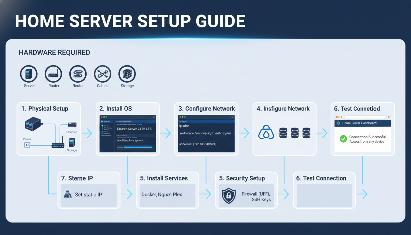
確認ポイント:
- 上部にハードウェアアイコン(コンピュータ、ルーター、ケーブル、ストレージ)があるか
- 6つのステップが番号付きで流れるように配置されているか
- ターミナルウィンドウやコードスニペットが含まれているか
- 青とダークグレーのテック感のある色使いになっているか
チェックポイント
- 手順説明図を生成した
- レシピ図解を生成した
- テクニカル図解を生成した
トラブルシューティング
テキストが読めない
原因: テキスト量が多い、フォントが小さい
解決策:
- 各要素のテキストを3-5語に制限
- 「large, legible font」を指定
- 重要な数字/キーワードのみ表示
- 詳細はキャプションで補足
図形が歪む
原因: 複雑な構造の記述が不十分
解決策:
- 図形の形状を明示(「rectangle」「circle」「diamond」)
- 接続関係を具体的に記述
- グリッドやレイアウトを指定
色分けがうまくいかない
原因: 色の指定が曖昧
解決策:
- Use specific colors: "Blue (#0066CC) for completed"
- Assign colors to categories: "Each department has a distinct color"
- Specify gradients: "Gradient from light blue to dark blue"
要素が多すぎて雑然とする
原因: 情報量が多すぎる
解決策:
- 要素数を5-7個に制限
- 複数の図に分割
- 「minimalist」「clean」「spacious layout」を指定
まとめ
このモジュールで学んだこと
- フローチャート: プロセス可視化、スイムレーン図
- 組織図・階層: 企業組織、ピラミッド、マインドマップ
- タイムライン: 横型/縦型、ガントチャート風
- 比較表: Before/After、製品比較、Pros/Cons
- インフォグラフィック: 統計、プロセス、データ可視化
- ステップバイステップ: 手順説明、レシピ、テクニカル図解
図解生成チェックリスト
- 論理構造を先に定義している
- レイアウト(方向、配置)を明示している
- テキストは各要素3-5語以内
- 色分けを明確に指定している
- アスペクト比を用途に合わせている
講座全体のまとめ
Module 01から09まで、Nanobanana画像生成の基礎から応用まで学びました:
| Module | 内容 |
|---|---|
| 01 | 概要・できること |
| 02 | 環境構築 |
| 03 | 基本的な画像生成 |
| 04 | プロンプトエンジニアリング |
| 05 | キャラクター一貫性 |
| 06 | 参照画像活用 |
| 07 | 実写・テキスト・編集 |
| 08 | ビジネスコンテンツ |
| 09 | 図解・インフォグラフィック |
これらの技術を組み合わせることで、様々なクリエイティブ用途に対応できます。
よくある質問
Q: 複雑なフローチャートは生成できますか? A: 10ステップ以上の複雑なフローチャートは精度が下がります。複数の図に分割するか、主要なステップのみを表示し、詳細は別途記載することを推奨します。
Q: データの正確性は保証されますか? A: いいえ。AIは与えられたデータを視覚化しますが、数値の検証は行いません。インフォグラフィックに使用する数値は、必ず事前に確認してください。
Q: 生成した図解を編集できますか? A: Nanobanana生成画像はラスター形式(PNG)です。ベクター編集が必要な場合は、生成した画像を参考にIllustratorやFigmaで再作成することを推奨します。
Q: 日本語テキストを含む図解は正確ですか? A: 短いラベル(3-5語)であれば高い精度で生成できますが、長文や複雑な漢字は精度が下がることがあります。重要なテキストは後から追加することを検討してください。
Q: どのアスペクト比を選べばいいですか? A: 用途に応じて選択してください:
- プレゼン資料: 16:9
- Instagram投稿: 1:1
- Pinterest/Stories: 9:16 または 2:3
- Webページ挿入: 16:9 または 4:3